Case study · Immvo
One listing, published everywhere
- Client
- Immvo
- Industry
- Real estate
- Country
- Portugal
- Year
- 2026
- Services
- Web & mobile apps
- Website design
- UX/UI design
- Branding & identity
- Web platform
- Multilingual network
- Real estate
01
The challenge
For a real-estate agency, publishing a property still means doing the same job several times over: the same photos, the same price and the same description, typed in by hand on every portal. Then the enquiries arrive scattered across email, phone and different platforms, and many agencies have no website of their own, or one that is slow and outdated.
Immvo was created to fix this, with a simple promise: "Real Estate Distribution. Auction Powered." The challenge was to build, from scratch, the product, the network and the brand that make it possible.
02
The solution
Immvo is operated by CRIATIMA in Portugal and Logic Technologies in Morocco. We are part of the venture, not just a supplier: we design and build the platform, the network sites and the identity.
The agency enters a listing once. Immvo publishes it on the international Immvo network, on the agency's own website and on real-estate portals, and brings every lead and statistic back to one dashboard, with the source of each enquiry. The offer is built around five services: the Immvo Network, with sites in more than 20 countries in the local language and currency (24 national domains across 6 regions, such as immvo.pt, immvo.fr or immvo.co.uk, being rolled out); a ready-made, fast, SEO-ready website on the agency's own domain; portal distribution; shared listings, MLS-style, where agencies add their own commission; and the single dashboard.
Because it belongs to the same group as Planet Enchères, Immvo can also put suitable properties up for auction alongside standard distribution. The platform is built for independent agencies, agent networks, developers, international agencies and franchises, and is currently in early access. The site is available in French, English, Spanish, Portuguese, Dutch, German and Italian.
03
The identity
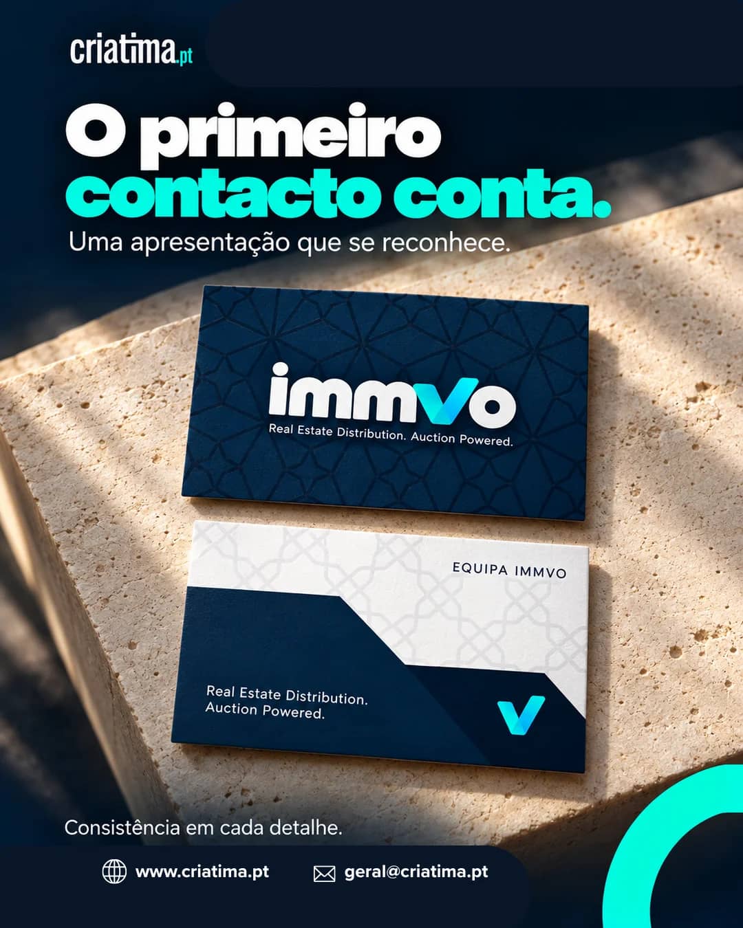
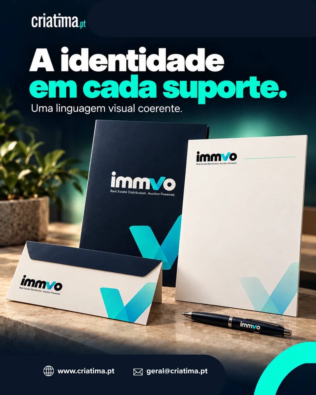
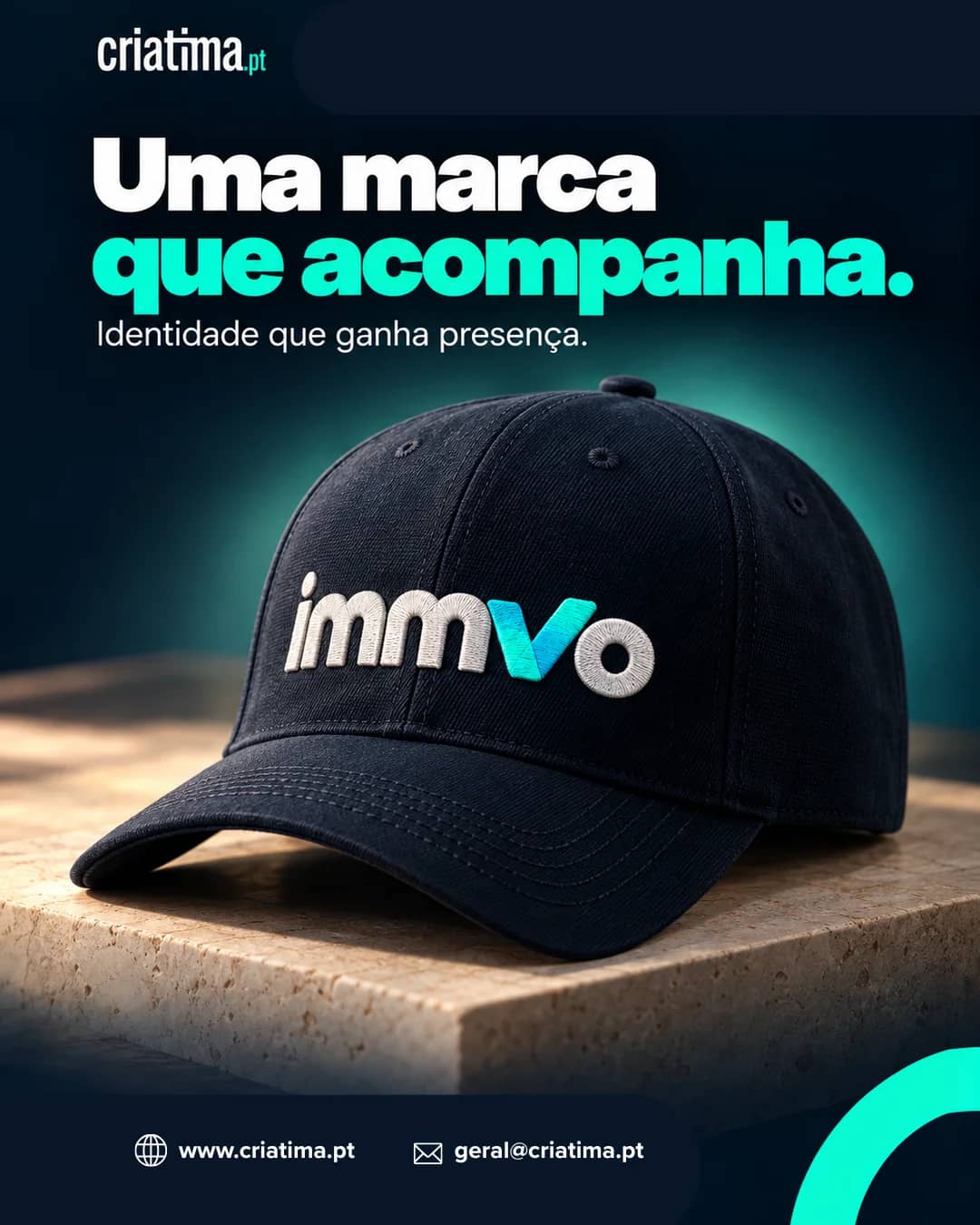
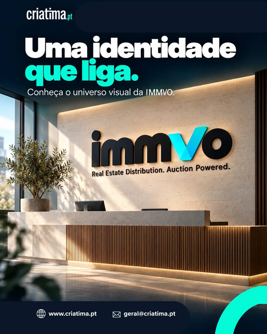
The brand is built on a wordmark whose blue "V" doubles as a check mark, a navy and cyan palette and a geometric pattern. We applied it to the team's business cards, stationery (folder, letterhead, envelope and pen), reception signage and merchandise.
Learn more about our web and mobile apps work.